
記事内に商品プロモーションが含まれる場合があります
BloggerのモバイルテーマをCSSで少しだけいじって、自分の好みの感じに仕上げてみました。
最近新しいテーマが出てきて、多くのBlogger使いの方がそれを使っているように感じるので、いまさら需要がないかもしれません。
デフォルトに飽きた方向けです。
CSSを貼り付けるだけで再現できます。
非IT系の素人が作成したので、おかしなところがあるかもしれませんのであらかじめご了承ください。
まず初めに
 CSSを貼り付けるだけでBloggerのデフォルトのモバイルテーマのデザインを変更する
カスタマイズが反映されるようにします。
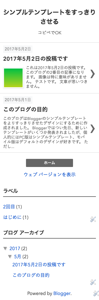
トップページ
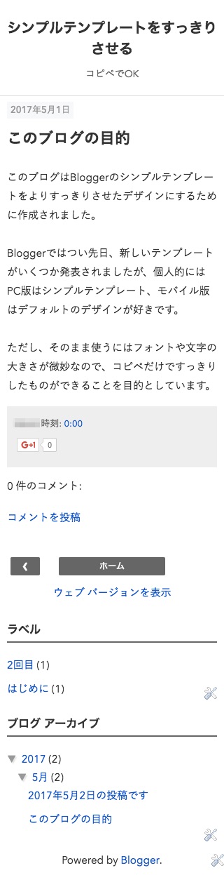
記事ページ
CSS
コード
CSS
/* モバイル用追加CSS
----------------------------------------------- */
body.mobile {
    font-size: 15px;
    font-family: "Avenir Next", -apple-system, BlinkMacSystemFont, "Helvetica Neue", YuGothic,'Yu Gothic', Verdana, Meiryo, sans-serif;
    color: #333;
    line-height: 1.8;
}
.mobile a, .mobile a:visited {
    color: #15c;
}
body .navbar {
    height: 0;
}
.mobile #header {
    text-align: center;
    padding: 15px 0;
}
html .mobile .header-outer, html .mobile .main-outer {
    margin: 0;
}
html .Header h1 {
    font-size: 20px;
    color: #333;
    line-height: 1.5;
    font-weight: 600;
}
.mobile .Header h1 a {
    color: #333;
    line-height: 1.5;
    font-weight: 600;
}
.mobile .Header .description {
    color: #666;
    font-size: 14px;
    line-height: 1.5;
}
html .header-inner .Header .descriptionwrapper {
    padding: 0;
    margin: 5px 10px;
}
.mobile .blog-posts.hfeed {
    border-top: solid 1px #ddd;
}
.mobile .date-header span {
    margin: 0;
    padding: 3px 5px;
    letter-spacing: 0;
    font-size: 13px;
    font-weight: 500;
    background-color: #f7f8f9;
    color: #999;
}
.mobile-index-title {
    font-size: 18px;
    font-family: "Avenir Next", -apple-system, BlinkMacSystemFont, "Helvetica Neue", YuGothic,'Yu Gothic', Verdana, Meiryo, sans-serif;
    margin: 8px 0;
    width: 100%;
    line-height: 1.5;
    font-weight: 600;
    color: #333;
}
.mobile-index-thumbnail .Image img {
    width: 60px !important;
}
html .mobile-index-arrow {
    color: #666;
}
html .mobile-index-contents .post-body {
    font-size: 13px !important;
    line-height: 1.2;
}
.mobile .mobile-post-outer:hover {
    opacity: 0.8;
}
.mobile h2.date-header, .mobile h3.post-title {
    font-family: "Avenir Next", -apple-system, BlinkMacSystemFont, "Helvetica Neue", YuGothic,'Yu Gothic', Verdana, Meiryo, sans-serif;
}
.mobile h3.post-title {
    margin: 15px 0;
    font-size: 22px;
    font-weight: 600;
    line-height: 1.5;
}
.mobile h3.post-title, .mobile .comments h4 {
    font-family: "Avenir Next", -apple-system, BlinkMacSystemFont, "Helvetica Neue", YuGothic,'Yu Gothic', Verdana, Meiryo, sans-serif;
}
.mobile .hentry .post-body {
    font-size: 15px;
    line-height: 1.8;
    color: #333;
    font-weight: 400;
    margin: 15px 0;
}
.mobile .post-footer {
    font-size: 13px;
    margin: 15px 0;
}
.mobile abbr.published {
    text-decoration: none;
}
.mobile #comments h4 {
    font-size: 15px;
}
.mobile .mobile-link-button {
    background-color: #666666;
}
.mobile .mobile-link-button a:link, .mobile .mobile-link-button a:visited {
    color: #fff;
}
.mobile .mobile-link-button:hover {
    opacity: 0.8;
}
.mobile #footer-1 {
    padding: 0 10px;
}
.mobile #footer-1 h2 {
    font-size: 16px;
    color: #333333;
    font-weight: 600;
    margin: 15px 0;
    border-bottom: solid 2px #666;
    padding: 5px 0;
}
.mobile #footer-1 ul {
    list-style: none;
    padding: 0;
}
.mobile #footer-1 ul ul {
    padding: 0 0 0 15px;
}
.mobile #footer-1 li {
    padding: 8px 0;
}
.mobile .status-msg-wrap {
    font-size: 14px;
    width: auto;
    margin: 10px auto;
    padding: 0 10px;
    position: relative;
}
.mobile .status-msg-body {
    text-align: center;
    padding: 5px 10px;
    position: relative;
    z-index: 4;
    box-sizing: border-box;
    background-color: #eee;
    border: solid 1px #ccc;
}
.mobile .status-msg-border {
	display: none;
}
貼り付ける場所
]]></b:skin>
を探して真上に貼り付けるだけです。